The post Is Canva diluting your brand? appeared first on Two10 Solutions.
]]>Visual marketing – as the term probably suggests – is using visual content to help reinforce your brand identity and message, across your marketing efforts.
There are lots of ways to go about this, and lately I’ve noticed a huge rise in small business owners using Canva to create blog headers, and graphics for their social media platforms. It really is great way to add visual identity to your brand message.
However, the approach many small business owners are taking could actually be doing unintentional harm to their brand and message.
The Canva approach
Canva offers lots of pre-existing design elements for you to choose between. Many of them are free, the rest are really cheap. It’s a process that’s gives you design freedom without you needing to spend time learning how to use difficult (and expensive) software. It also handily circumvents that challengeing moment of staring at a blank page and wondering where on earth to begin.
In short: it’s easy and it’s fun.
The downside is that everyone else is using the same elements and the same approach. The result? Visual content that is not necessarily linked to your brand, but to the Canva brand.
Time and again, across various social media channels, I’ve seen business owners create visual content. The responses from their friends and followers often follow some variation of the below comments:
“Love your visual. You created it using Canva right?”
“Ah..I see you’ve discovered Canva! It’s great, isn’t it?”
“Awesome graphic. I love Canva too! It’s so easy to use.”
How is Canva diluting your brand?
To me, the immediate thought that springs to mind is that this just proves how visually literate you all are. Canva has an identifiable design aesthetic, and most people seem to be able to identify it.
The point of visual marketing is to create imagery that connects back to your brand. In the same way that you want your blog’s voice to be consistent and reflective of your brand, your visuals need to fulfil the same role. If you’re creating visual marketing that is readily identifiable as ‘Canva’ rather than you, you’re wasting that opportunity to connect visually with your readers and followers.
I’m not for one second advocating not using Canva, or creating your own materials. But make sure you’re adding value to your brand while doing so, not diluting your brand.
How to use Canva to promote YOUR brand (not theirs)
Brand identity is generally built using some basic foundational elements. Keep these consistent, and your visual marketing materials will be a much closer reflection of your brand and business.
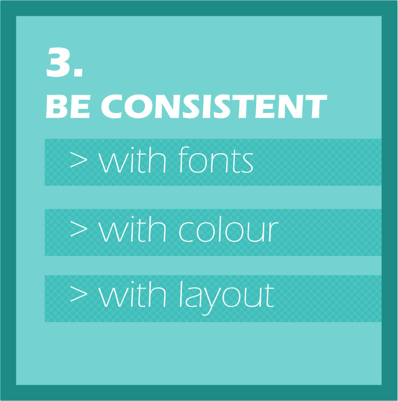
1. Keep fonts consistent.
Fonts are really important.
It may seem like a little thing, but picking fonts is one of the key ingredients in your design and brand identity. Stick to the fonts already used on your marketing materials and website.
If you’re not sure what they are, go back and ask the designer which fonts they used. You may not have access to the same ones, but some research on Google fonts or Font Squirrel, and you’ll be able to find an equivalent that closely matches.
For example, if your website is using handwritten fonts, and has a crafty feel, then creating (popular and trendy) retro-themed marketing material isn’t going to match your brand or reinforce your identity.
2. Colours
Stick to your brand’s colour palette.
Use the colours in your logo and the colours on your website. You can create tints of those colours to increase your options. This tool can help you create some darker and lighter tints of your existing brand colours.
If you feel like you need more colours, spend some time one day using a colour palette mixer to create your own custom palette. Try to end up with a maximum of 6 colours, together with some tints.
Once you’ve decided on these colours, save them down somewhere and use them as your reference. And then stick to them!
Keep in mind, that fewer colours often work better in designs, so you might be best just sticking to the 2 or 3 colours in your logo and website.
3. Gather your own design materials
Canva is great and has a wide range of pre-existing elements for you to use, but you don’t have to be restricted by what is on offer. You can also upload your own design elements.
We’ve got a Pinterest board of Freebies that we’ve been collecting from various place on the internet, that is updated regularly. It’s a board of illustrations, icons and fonts. Follow ours, or start your own.
Start your own library of brand-relevant illustrations and photos. Be strategic in what you collect, keeping your brand, your industry and your audience in mind.
4. Keep your range narrow
It’s tempting, when faced with a smorgasboard of options such as offered on Canva, to want to try and use everything. My best advice is to resist that temptation.
Think about your brand, and its identity. Get your fonts decided, pick your colours and then set up some templates. Think about how you can keep them consistent, and then try to work within those guidelines and constrictions. It might feel less ‘creative’, but it will make your brand message much stronger.
Canva has created a really clever, easy-to-use tool, to help you take charge of your own visual marketing. Use it to your advantage, and reinforce your brand identity.
The post Is Canva diluting your brand? appeared first on Two10 Solutions.
]]>The post Simple ideas to help you take charge of your visual marketing appeared first on Two10 Solutions.
]]>
Audience: ‘Good design’ isn’t a one size fits all approach. When you’re adding design touches to your website, or even designing your own fliers or brochures, as with all your marketing, you need to consider your target client.
If you’re a technical business, then a vintage, colourful approach will not impress your target market. They want to see a design that reflects your competence and professionalism.
The final product: A good example of this is designing a cover for your ebook. A particular design may look great at full size on your computer, and it may look alright shrunk down on a tablet or phone.
Have you considered how it also works as a thumbnail image?
If you’re going to be using that cover image primarily as a device to grab the attention of your website visitors, then it needs to jump off the screen, even if it’s only tiny.
Consistency: Don’t use loads of different fonts in your designs. Usually 1 or 2 fonts is plenty. You can mix and match their bold and italic forms to create contrast.
Keep your design consistent. Once you’ve picked your fonts, colours and general layout pattern, stick with it. The most common mistake people make is that they think ‘good’ design should be complicated. The opposite is true – good design generally is simple.
Don’t confuse simple with ‘easy’ – it’s not necessarily easy – but simple, uncluttered and consistent is what you’re aiming for.
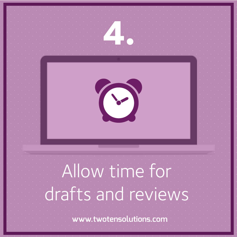
The editing process: Just as it takes time to craft a good blog post, or put together the copy for your website, you can’t expect to just sit down and knock out a good design. The approach to take is very similar to writing, actually.
Put aside some time to do a first draft, and try not to let your editing side take over yet. Try a few different things, move images around, put text over the top, make your text box transparent. Create a couple of options and then leave it alone.
Come back a day or 2 later, and see what your reaction is when you look at it. I often find that I have a gut instinct that something is working or not working. My client may not always agree with me, but most of the times I do get it right.
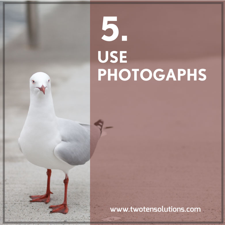
Photographs: A really simple and effective design approach is pairing photographs with text. A strong image, with text overlaid can look really nice. Make sure you put the text over a clear space in the image so that it stands out.
If there isn’t really a good existing spot, you can draw a box or rectangle behind the text and then reduce the opacity of the box.
To ensure your imagery is unique, why not take your own photographs to use in this way?
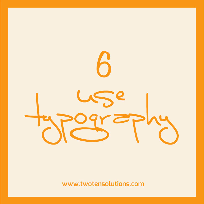
Typography: A nice simple design technique is to just use text on a simple, coloured background.
Mix up your fonts (not too many, less is still more here), and experiment with having all the text centred, or all pushed into one corner.

Avoid tacky clip art. Seriously. It is not doing anything to help your cause. I’m talking specifically about the cheesy, overused visual metaphors that are sprinkled all over the internet.
There are so many resources out there where you can get great illustrations for little to no cost. There is absolutely no excuse for clipart. None.
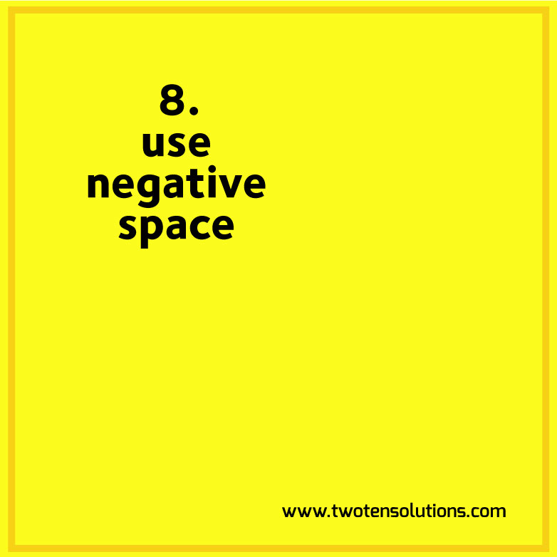
Negative space: is the amount of space left around the elements of your design. (white space is another term you may come across, but don’t feel you need to take it literally).
The whole point of design is that you want to get a message across, and to be successful that message needs to be clear. Visual breathing room lets the viewer read your message more clearly.
A page or website that is cluttered with too much stuff, is going to leave the visitor bouncing around, their eyes falling on one thing, then another, then another. It’s chaotic, confusing and – for me at least – annoying.
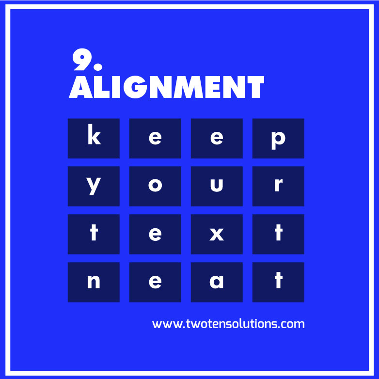
Alignment: So easy to do, and it makes such a massive difference. Take the time to make sure the elements in each group of your design are aligned properly. Even in programmes like PowerPoint there are built-in tools to help you achieve this.
Elements that are all sitting on the same vertical and horizontal plane make visual sense and therefore add to your message. Elements that are higgledy-piggledy are confusing, annoying and generally unpleasant to look at.
In conclusion: These are really very simple techniques, and not hard to achieve by yourself.
Instead of having yet another generic stock image at the top of your post, put aside some time one day to come up with a template or idea that you can then use for all your posts. It will give your posts a visual consistency that ties back in with your brand, in the way that yet another picture of a kid in a cape wearing oversized glasses just doesn’t.
The post Simple ideas to help you take charge of your visual marketing appeared first on Two10 Solutions.
]]>The post 9 tips to help writers with visual marketing appeared first on Two10 Solutions.
]]>
As a small business owner, you probably already do some of your own writing – blog posts, your website copy and marketing copy. You may not be a ‘professional’ writer, but the point is that you do write, and you also think like a writer.
Here’s a little secret. You can take all those tricks you already know about writing and use them to create your own visual content.
“But I’m terrible at visual stuff” I hear you cry.
You know what, you absolutely are not. You can create branded, visually literate imagery to spice up your content. You just need a bit of practice, some faith in yourself, and some commitment to your cause.
Don’t believe me? Let’s get started.
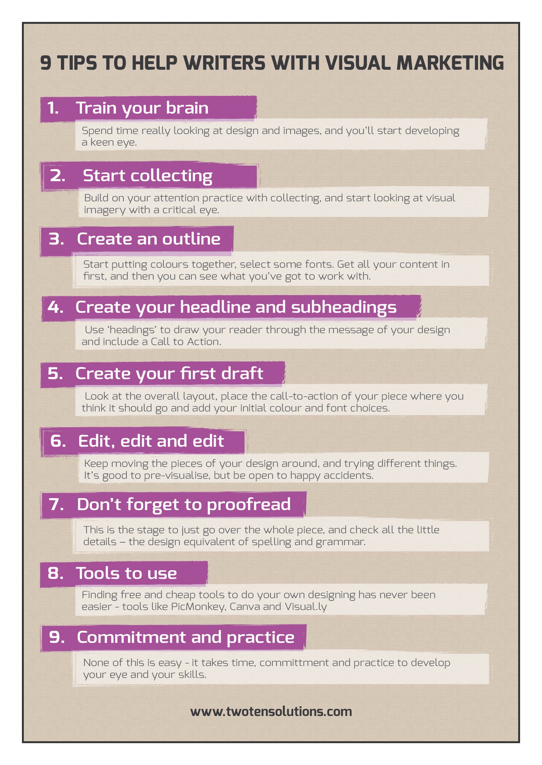
1. Train your brain
One piece of (really good) advice handed out to writers is that they need to read. Not just within their own genre, but across lots of different genres. Exposure to different types of writing gives the little writer homunculus in your brain plenty of fodder to work with when it comes time for him to get to work.
It’s no different with your visuals. Spend time really looking at design and images, and you’ll start developing a keen eye. The good news is that you’re doing this already – just think about the bombardment of imagery you’re subjected to every single day.
The only real change you need to make is to be more present and pay attention.
2. Start collecting
Build on your attention practice with collecting.
Online, there are endless examples of design that will grab your attention. If you love working socially, you’ve got Pinterest, and Instagram. Use folders and bookmarks on your devices if you’re more of a private collector type.
Don’t limit yourself to the virtual though. You know how everyone loves a vintage, textured background? That’s because they look and feel so nice in real life. Now, don’t you wish you had a nice collection of vintage stock postcards to flick through right now?
Start thinking of business cards as more than just a way of emailing someone you met at a networking event. Start collecting them with visual intent. Keep them handy as a reference tool, because chances are at some point you’ll want to look at one of them again to see what it is that made you remember it.
Take the same approach with postcards, magazines, posters, photographs. Start looking at this imagery with a critical visual eye. Think about how they work as marketing tools, and how they go about selling their product.
There you go! Now you’re starting to think like a designer.
3. Create an outline
OK, so you’ve been paying attention to the visual world around you, you’ve got your collections of fun stuff you like, and you’re ready to start getting all visual with your content marketing.
Where to start?
As with a piece of writing, think about it in terms of drafts and revisions.
How do you go about crafting a written piece? Personally, my approach is piecemeal. I tend to write over a few days, in different stages. Initially, I write down some headlines, subheadings, and jot down sentences that may or may not make complete sense. It’s just getting down the framework of what I’m going to come back and massage into shape.
Same deal with your visuals. Start putting colours together using online tools such as Adobe Kuler or Color Blender. Select some fonts that you might want to work with – Google Fonts are pretty extensive and free to use.
Hopefully you’ve already got the words that are going into your design. Professional designers often work to a brief without all the content, and then need to revise the design to fit it all in. It’s inefficient at best, and a total design wreck at worst.
Get all your content in first, and then you can see what you’ve got to work with.
4. Create your headline and subheadings
As with your written pieces, your design needs to have a logical progression that your reader will look at. Use ‘headings’ to draw your reader through the message of your design.
Graphic design is marketing, not art. You are asking your audience to ‘read’ your message, you guide them through the process. As with your written marketing, you need to include a Call to Action.
Colour, boxes, different font sizes, photographs and illustrations are all tools to draw your reader through your message.
Visuals can be more efficient than words though, and that’s why the right photograph, illustration, series of shapes, or even font, can really nail your message.
5. Create your first draft
As with writing projects, you are going to have to go through a few rounds of drafts before you get your final result.
Personally, I’ve always found the editing part of writing easier than the initial stage. No matter how horrible a first draft is, having something to work on is more motivating that staring at the dreaded blank page. Filling in the guts through the editing process is hard work, but somehow is an easier process.
Same with design. Get your first draft done, and then step away and leave it for a while. Next time you come back to it, you want to look at it with fresh eyes.
Don’t get too bogged down in the details at this stage. Look at the overall layout, place the call-to-action of your piece where you think it should go and add your initial colour and font choices.
All or some of this will probably change through your revisions, but it’s important to just get started.
6. Edit, edit and edit
As with writing, your final piece may bear no resemblance to your initial piece. If the colours you have chosen aren’t working, try some new ones, or just different shades. Keep moving the pieces of your design around, and trying different things. I can’t count the number of times the ‘a-ha’ moment of my design has come while trying something else.
It’s good to pre-visualise, but be open to happy accidents.
7. Don’t forget to proofread
This is the stage to just go over the whole piece, and check all the little details – the design equivalent of spelling and grammar (don’t forget to check your actual text for these errors too!)
Follow a simple checklist to make sure everything is neat and consistent.
- Are all your elements are aligned correctly?
- Do all the boxes and tables have consistent margins?
- Is your heading text is a consistent size?
- Body text and subheadings – are they consistent too?
- Do all the colours match?
Really go over it with a fine-tooth comb to check the itty-bitty details.
8. Tools to use
Finding free and cheap tools to do your own designing has never been easier.
Photoshop Elements is watered down version of that design workhorse Photoshop. Elements is much cheaper (buy it outright for around $150), easier to use, and will do all the light design tasks you ask of it.
GIMP goes one step better, and is absolutely free. You can use it to work with your photos, add some text and shapes over the top. The interface is a little clunky, so you might not enjoy the learning curve that goes with using it. Picmonkey is generally pretty popular, and you can use some of the basic tools for free.
If you like mucking around with illustrations and drawing, Inkscape is a free vector program. You can draw and create to your heart’s content.
The new kid on the block – Canva – is on a mission to make graphic design simple and accessible. They’re still working out some bugs on their beta launch, but if you’re patient, you can create great things using their software.
And finally, you can create your own infographics using Visual.ly
9. Commitment and practice
I do truly believe that any business owner can take charge of their own visual marketing and output. That doesn’t mean it’s easy to do, though! It takes time, committment and practice to develop your eye and your skills.
As with most of your business decisions, whether you want to take on the challenge comes down to whether you want to spend time doing it yourself, or spend money to have it done by someone else.
Have you taken control of some or your own visual marketing? How have you found the process?
The post 9 tips to help writers with visual marketing appeared first on Two10 Solutions.
]]>
Are you ready to start taking charge of your own visual content?
Even if you think you’re ‘visually challenged’ you CAN create imagery that supports your brand and message.
![]()
1. Keep your designs simple
The main trap that DIY designers often fall into is trying to cram too much into their design. Squeezing every colour combination, font choice, photograph, texture, shadow and effect into a single design is really not going to help to clarify your marketing message.
In design circles we talk a lot about “white space”, and understanding how to use it is key to keeping your design looking neat. Don’t take the term too literally, “white space” can be any colour, but the idea is that you give plenty of room to your design elements. Let them breathe.
A crowded design is not only messy, but is ultimately redundant, as your marketing message will be lost and muddied.
![]()
2. Look around with a critical eye
Design isn’t a dark-art that only a few select and kooky types are born with. As with any skill, it does come easier to some more than others, but with commitment and practice, it also can be learned.
Ideas don’t just appear out of nowhere. They have to be cultivated, and the best way of doing this is by looking at what others have done already. Start bookmarking websites that you like the look of, and when you’ve got some time browse through them and think about what it is you like. Collect fliers and business cards. Have a folder somewhere of stuff you come across that you like, or find interesting. When you sit down to do your own project, look through this inspiration pot of others’ visual content, for some ideas to get you started.
![]()
3. Use fonts wisely
It can be easy to get carried away with using lots of different fonts, but resist that urge.
Use a safe, traditional font for the body copy of your project – Helvetica, Tahoma or Verdana. These ‘boring’ fonts have been designed for readability, so let them do their job.
To inject some creativity into your design, save the fun font for your headings, as well as any highlight or call-to-action text. To get extra variety, mix up the different font weights of a single font family. Most professional fonts come with different weight and italics options, and it’s using this mix that will help your design to come together. Also experiment with CAPS and varying font sizes.
![]()
4. Use your own photos
The quality of image file that your smartphone produces is easily good enough for use as a blog image. Experiment with filters and apps on your phone to beef up the visual style of the photos you take. Not sure where to start? Here are some tips on creating your own smartphone images.
Be consistent with how you create your visual content, and you’ll find that you’ve generated a recognisable visual theme around your brand. This is going to make you stand out above everyone else who is using the same old recycled free and cheap stock images.
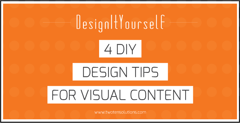
The post 4 DIY design tips for visual content appeared first on Two10 Solutions.
]]>
Your marketing plan needs to have a visual component, but if you’re using the same free photos as everyone else, how are you going to stand out?
![]()
1. PUT THAT SMARTPHONE TO WORK
You see that smart phone you drag with you everywhere? The camera on your phone produces image files that are well and truly big enough to use on your blog or website.
Instead of trawling the internet and stock libraries, start your own photography collection. Random textures, colours and objects that take your fancy. Build up your own mini-stock library that you can then raid when you need to.
![]()
2. See the light
A really quick and easy way to get your photographs looking more ‘professional’, is to use natural light properly. Stand in front of a window or glass door, and face into the room. Place the object or person you’re photographing in front of you (looking towards the window). Seriously, it’s that simple. Try it out, and I guarantee you’ll notice a difference to your images.
![]()
3. Filters are your friend
Photography filters on smart phones can really turn a ‘blah’ image into something more striking. Take a look at Snapseed for editing, PicLab HD for adding text, and Gelo to add coloured filters. And of course, there’s everyone’s favourite, Instagram, if you’re after a quick retro-hit.
![]()
4. Edit, edit, edit (for free)
Get creative with free online tools to edit, crop, layer and add text to your images. Sites like Picmonkey and Pixlr give your free creative reign with your images, without needing to spend a penny on software. GIMP is another free tool with lots of capability, but it will take longer to work out how to use it.
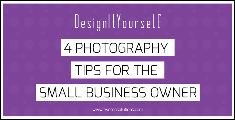
The post 4 photography tips for small businesses appeared first on Two10 Solutions.
]]>The post How to add a custom background to your Weebly website appeared first on Two10 Solutions.
]]>You do need to delve into the code behind the scenes, but the beauty of Weeby templates is that their editor shows you the update as soon as you make the change. So even if you don’t really understand CSS, with some trial and error you can quickly work it out.
Step 1: Find the CSS code to edit your Weebly website
We’re going to use one of the pre-defined Weebly templates as our example to work on. Click on the Design tab and then click on Edit HTML/CSS.
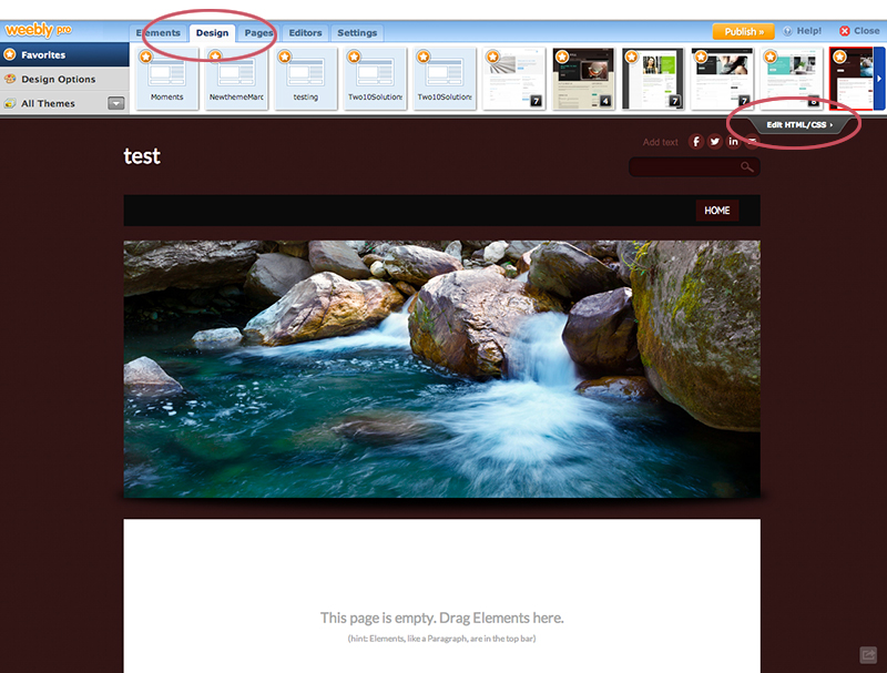
You will see a screen displaying all the HTML and CSS code that is driving your website template. Don’t worry if you don’t understand how it all looks, we will only be interested in changing a couple of small things to update your website background.

Step 2: Upload your new background image
Click on the Add new file button and browse to the image that you want to use as your background. For our example, we’ve named our image “new-background.jpg”
The editor will put your image into the existing list in alphabetical order. If you click on it, you will then get a preview of the image, as well as the option to rename or even delete it.
We’ve gone with some striking polka dots to make sure you can see the difference!

Step 3: Upate the code
This is the bit you may find scary, but don’t be. It’s really very easy!
Go back to the main-style.css section and scroll through the code until you find a body { } tag. The templates are all set up slightly differently, and so the code is not identical from one to the next. However, what you are looking for will look something like this:
body {
background-color: #301515
background: url(body-bg-red.png);
font-family: Lato, Arial, Helvetica, sans-serif;
font-size: 13px;
color: #666666;
margin: 0;
padding: 0 0 50px;
}
The part that interests us is the background url element. Simply replace the name of your new image file and it will update the background of your entire website. So, for our example, we have changed the code to read:
background: url(new-background.jpg);
And now our site has polkadots as the background!

Step 4: Image size
One last thing to bear in mind is the size of the image you upload. If you want 1 single image across the entire background of your site, make sure you size it correctly for the website.
The background image size should be a maximum of 481px by 320px. A smaller image size would also work, but you might have to experiment to get it just right.
If you do use a smaller image, and you want it to repeat across the background (which is what we have done with our polka dots up there), then you just need to add repeat or no-repeat to the code.
background: url(body-bg-red.png) repeat; – this will repeat your image as a pattern across the background.
background: url(body-bg-red.png) no-repeat; – this will show just 1 instance of your background image.
Step 5: Save and close to return to your website
The editor will have given you a preview of how your new background looks as soon as you update the code.
If you’re happy, hit the Save button in the right corner. If you think you’ve mucked it up, hit the Cancel button and none of your changes will have been actually applied to your website.
If you would like some help with your website design, we work with clients across many platforms including design for Weebly websites.
The post How to add a custom background to your Weebly website appeared first on Two10 Solutions.
]]>The post Transfer Google Analytics without losing historical data appeared first on Two10 Solutions.
]]>
*** UPDATE — APPARENTLY GOOGLE HAVE CHANGED THE GOALPOSTS AND THE BELOW STEPS NO LONGER WORK. ****
I love the internet, I find it a totally fascinating place, and I’ve been working online for many years now. As a result, I’ve got all sorts of projects scattered across the web – under different accounts, linked to different email addresses, using different blogging platforms. It’s a bit of a mess, if I’m honest.
(For the record, it’s nothing sordid. I am also a freelance photographer).For better or worse, it’s becoming increasingly clear that if you want to be taken seriously online, you need to start owning your internet identity. And so, I’m on a quest to streamline my various presences.
I started simple, and worked out how to juggle multiple Google accounts. Sometimes the simplest things can cause the biggest headaches!
My next step has been working out how to unscramble my Google Analytics. I’ve set up Analytics for this website, for my photography website, and project-based photography blogs. In bursts of well-meaning but poorly-researched enthusiasm, I had gotten the whole shebang in quite a mess.
It was a mini-nightmare to unravel, but I did work it out, and during the process I realised that the shifting nature of the Google goalposts has serious implications for many businesses.
Transfering Google Analytics without losing historical data
A good example are online marketers who are running into problems where they have set up client accounts under their own Google Analytics accounts, and are having trouble separating them out.
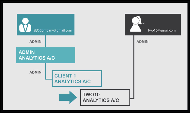
Let’s have a look at an example, where a mythical SEO company has been looking after the Analytics for Two10 Solutions, as well as other companies they run this service for.
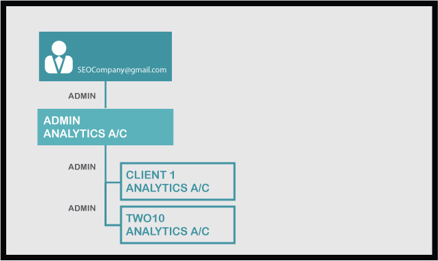
SEOCompany has set up Analytics tracking for all their clients under the umbrella of their own account. It would seem to make sense to do that initially, so they don’t need to keep logging in and out of different accounts to do tweaking and reporting for their clients.
However, Two10 have decided to move control of their account in-house, so now the SEOCompany have a problem. They can’t just give Two10 access to their account, as the account contains all the information for other companies they are running Google Analytics for.
Two10 can set up a new account under their own steam and start tracking from that point forward, but how do they access all the historical data and information?
Step 1: Add a new user to the original Google Analytics account
- Create a new Gmail account for Two10 (if they don’t already have one).
- Log in to the over-arching Analytics account ([email protected]), and go down to the level of Two10 Analytics
- Add a User to the account ([email protected]), and make sure they are Administrator for this account. This is very important.
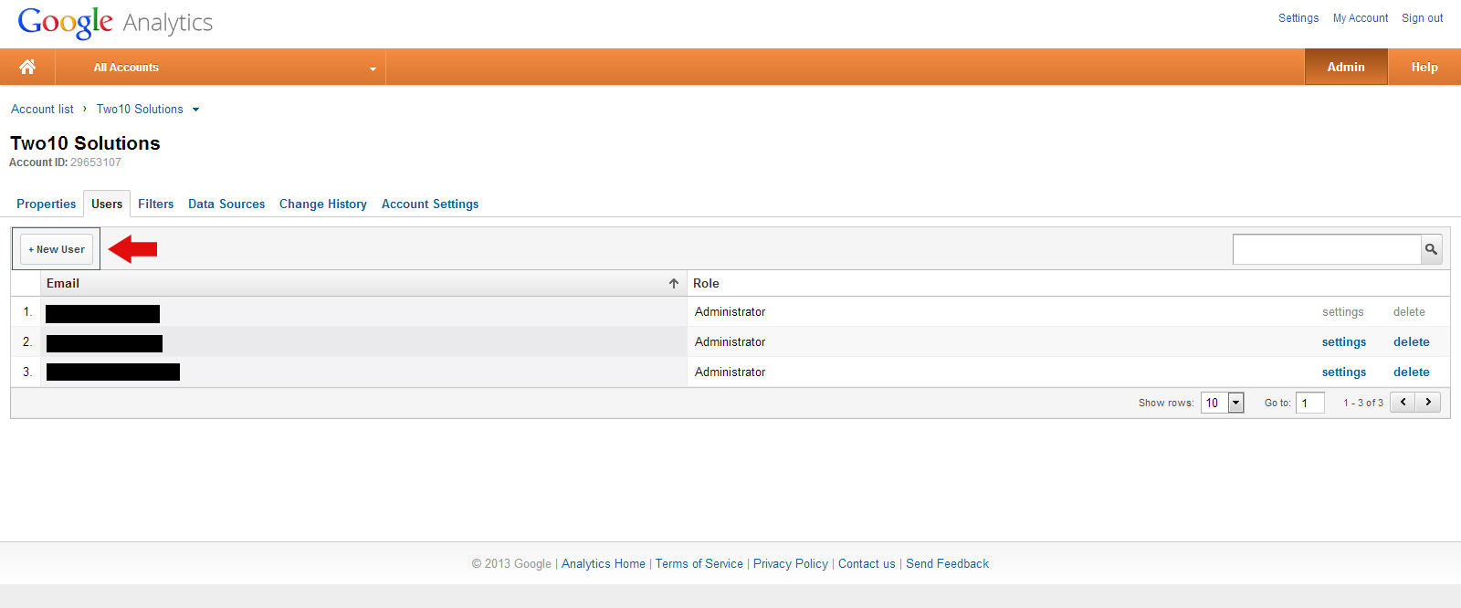

Two10 Analytics now has 2 Administrators.
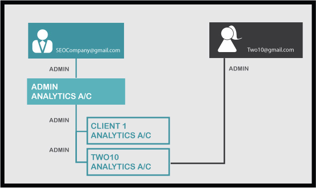
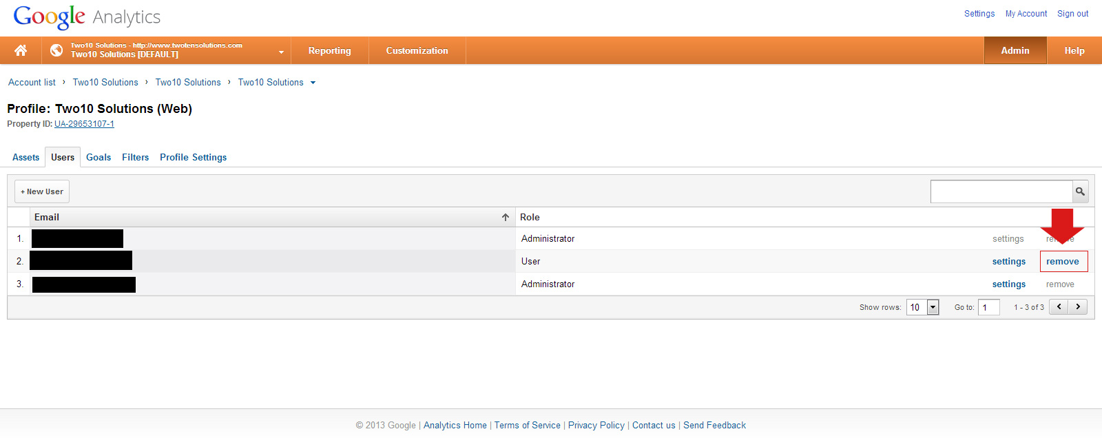
Step 2: Delete the original Administrator from the Analytics Account
- Logout of [email protected]
- Log in as [email protected] – because Two10 is an Administrator, they have total control over the account now.
- Demote [email protected] from Administrator to User
- Delete [email protected] from the account (you can’t delete an address associated with an account if they are still an Administrator, which is why you have to do the demote step first)
In this example, [email protected] is now in charge of their own Analytics Account, with all the historical data intact and migrated.
So, it’s a bit fiddly and involves some logging-in/logging-out/logging-in nonsense. But it does mean that all is not lost if you initially started running Analytics without really understanding the bigger picture.
I’m sure this is just the tip of the iceberg for problems people are having while navigating the ever-changing currents of GoogleWorld. If you’ve got an easier way to do this, or any other suggestions or questions, just pop a comment below and let’s see what we can sort out together.
The post Transfer Google Analytics without losing historical data appeared first on Two10 Solutions.
]]>The post How to switch between multiple Google accounts appeared first on Two10 Solutions.
]]>Google +, Google Places, Google Analytics, Google Adwords. Each has it’s own necessary place in online marketing for your business, and ideally you want them all to work in harmony with each other.
But what if you have a “scattergun” relationship history with Google? Over the years they’ve been tweaking their services, and alongside them you’ve probably been signing up to different offerings, creating multiple accounts linked to various email addresses that you may or may not remember setting up in the first place.
Sound familiar?
Well, that’s definitely a brief synopsis of my torrid history with Google, and when I recently tried to pull it all together for my business I was faced with a perplexing tangle of accounts that seemed impossible to streamline.
My tangled history with various Google Accounts
Me and Google go waaay back. I’ve got an email address that was set up back when Gmail was all beta. When only the cool kids got on board with an invite and 1 GB of data seemed like an outrageous amount of email space.(Disclaimer: I was never a cool kid, I just worked with some geek-types who loved sharing all the new stuff.)In brief, my personal GoogleMess looked something like this:
- An old gmail account that had been gathering dust for about 10 years.
- A gmail account linked to my old photography website and business
- Google Analytics set up under the photography email (running analytics for my current business AND photography website)
- Google Analytics set up under the resurrected email address (meant to be running analytics for my current business but not set up properly)
- Google + accounts for both email addresses
- Adwords account(s) that doesn’t (don’t) know WHO to play with!
I’ve been dancing a merry jig for the last few months, logging in and out of the different accounts. Checking email in one, but not being able to access Analytics at the same time. I thought I had it cracked when I discovered this feature:


The post How to switch between multiple Google accounts appeared first on Two10 Solutions.
]]>The post Weebly tutorial: how to change the banner background appeared first on Two10 Solutions.
]]>Our tutorial, how to change your website background, shows you how to upload a background image across your site.
Another question that has been asked of us, however, was how to change the background of the banner at the top of the page. Let’s look at an example.
Webpage before changing banner background

Webpage after changing banner background

We’ve taken an existing Weebly template and made the background blue. You can see that the banner at the top works independently to the rest of the background.What if you don’t want your banner to be a big rectangle at the top? You don’t have to be constrained by that design aesthetic, although it is a neat and common choice for many business owners.
Create your background image
When creating the image that you want to place in your banner, remember if it doesn’t have a background, and you want to retain the transparency, you need to create it as a PNG file.
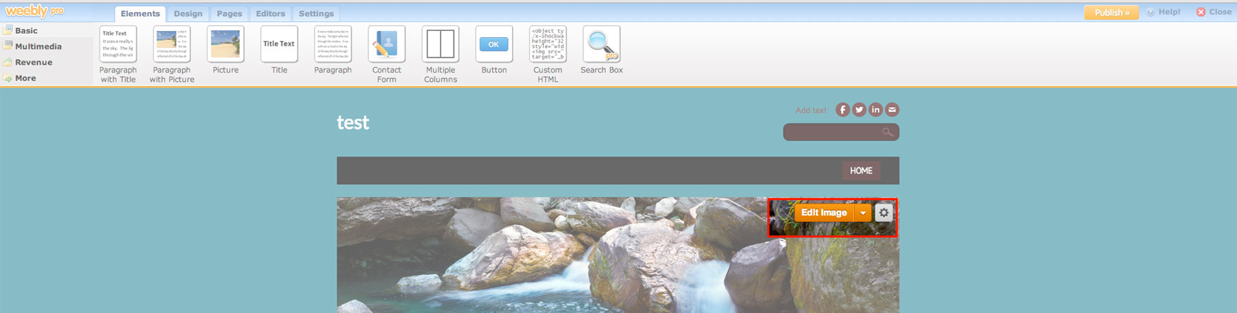
When you are ready to start making your changes, click on the Edit Image button. This will open the banner editor and bring up a toolbar with your editing tools.

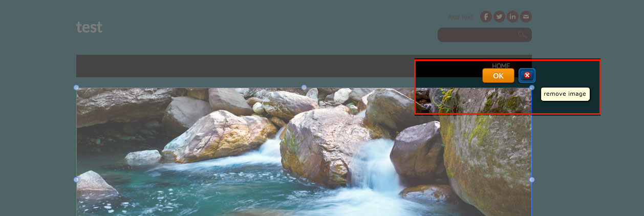
Replace existing image


If you would like some help with your website design, we can work with you on the platform of your choice and preference.
The post Weebly tutorial: how to change the banner background appeared first on Two10 Solutions.
]]>The post Standard Fonts for PC and Mac appeared first on Two10 Solutions.
]]> © Tiero | Dreamstime Stock Photos & Stock Free Images
As a designer, your choice of font is integral to your design and vision. Yet, understanding how to get those fonts to work across different platforms for your clients’ needs can be really frustrating, especially if you are creating a report or brochure that your client is going to be using with MS Office.
Fonts that are standard on a Mac don’t always translate across to the PC platform, and vice versa, and the problem is even worse with non-standard fonts.
Keep the following points in mind next time you are designing with a non-standard font, and you may save yourself and your client some headaches:
- Non-standard fonts are not cross-compatible between PC and Mac. If you are working on a Mac, and your client on a PC, you will need to ensure the relevant fonts are purchased and installed on all machines. The PC version for them, and the Mac version for you.
- A template or presentation created in Microsoft Office on your Mac will work on a PC. The non-standard font you used, however, will not travel with the file. Ensure your client has the PC version of the font on their machine.
- When we create templates or presentations for our clients, we also need a copy of the font.
- Before starting a design, check this list of standard fonts that work with Microsoft Office. Sometimes it is best to stick with a standard font.
We have tonnes of experience working with corporate and mid-sized businesses, and know how to juggle great design with user practicality when designing and creating reports to be used in-house.
Have a browse around some of our brochure design work.
The post Standard Fonts for PC and Mac appeared first on Two10 Solutions.
]]>