
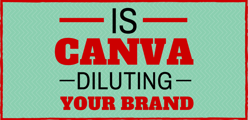
Using visual marketing
Visual marketing – as the term probably suggests – is using visual content to help reinforce your brand identity and message, across your marketing efforts.
There are lots of ways to go about this, and lately I’ve noticed a huge rise in small business owners using Canva to create blog headers, and graphics for their social media platforms. It really is great way to add visual identity to your brand message.
However, the approach many small business owners are taking could actually be doing unintentional harm to their brand and message.
The Canva approach
Canva offers lots of pre-existing design elements for you to choose between. Many of them are free, the rest are really cheap. It’s a process that’s gives you design freedom without you needing to spend time learning how to use difficult (and expensive) software. It also handily circumvents that challengeing moment of staring at a blank page and wondering where on earth to begin.
In short: it’s easy and it’s fun.
The downside is that everyone else is using the same elements and the same approach. The result? Visual content that is not necessarily linked to your brand, but to the Canva brand.
Time and again, across various social media channels, I’ve seen business owners create visual content. The responses from their friends and followers often follow some variation of the below comments:
“Love your visual. You created it using Canva right?”
“Ah..I see you’ve discovered Canva! It’s great, isn’t it?”
“Awesome graphic. I love Canva too! It’s so easy to use.”
How is Canva diluting your brand?
To me, the immediate thought that springs to mind is that this just proves how visually literate you all are. Canva has an identifiable design aesthetic, and most people seem to be able to recognise it.
The point of visual marketing is to create imagery that connects back to your brand. In the same way that you want your blog’s voice to be consistent and reflective of your brand, your visuals need to fulfil the same role. If you’re creating visual marketing that is readily identifiable as ‘Canva’ rather than you, you’re wasting that opportunity to connect visually with your readers and followers.
I’m not for one second advocating not using Canva, or creating your own materials. But make sure you’re adding value to your brand while doing so, not diluting your brand.
How to use Canva to promote YOUR brand (not theirs)
Brand identity is generally built using some basic foundational elements. Keep these consistent, and your visual marketing materials will be a much closer reflection of your brand and business.
1. Keep fonts consistent.
Fonts are really important.
It may seem like a little thing, but picking fonts is one of the key ingredients in your design and brand identity. Stick to the fonts already used on your marketing materials and website.
If you’re not sure what they are, go back and ask the designer which fonts they used. You may not have access to the same ones, but some research on Google fonts or Font Squirrel, and you’ll be able to find an equivalent that closely matches.
For example, if your website is using handwritten fonts, and has a crafty feel, then creating (popular and trendy) retro-themed marketing material isn’t going to match your brand or reinforce your identity.
2. Colours
Stick to your brand’s colour palette.
Use the colours in your logo and the colours on your website. You can create tints of those colours to increase your options. This tool can help you create some darker and lighter tints of your existing brand colours.
If you feel like you need more colours, spend some time one day using a colour palette mixer to create your own custom palette. Try to end up with a maximum of 6 colours, together with some tints.
Once you’ve decided on these colours, save them down somewhere and use them as your reference. And then stick to them!
Keep in mind, that fewer colours often work better in designs, so you might be best just sticking to the 2 or 3 colours in your logo and website.
3. Gather your own design materials
Canva is great and has a wide range of pre-existing elements for you to use, but you don’t have to be restricted by what is on offer. You can also upload your own design elements.
We’ve got a Pinterest board of Freebies that we’ve been collecting from various place on the internet, that is updated regularly. It’s a board of illustrations, icons and fonts. Follow ours, or start your own.
Start your own library of brand-relevant illustrations and photos. Be strategic in what you collect, keeping your brand, your industry and your audience in mind.
4. Keep your range narrow
It’s tempting, when faced with a smorgasboard of options such as offered on Canva, to want to try and use everything. My best advice is to resist that temptation.
Think about your brand, and its identity. Get your fonts decided, pick your colours and then set up some templates. Think about how you can keep them consistent, and then try to work within those guidelines and constrictions. It might feel less ‘creative’, but it will make your brand message much stronger.
Canva has created a really clever, easy-to-use tool, to help you take charge of your own visual marketing. Use it to your advantage, and reinforce your brand identity.


