
What is a CTA (Call to Action)?
Think of a CTA as instruction for what you want your visitors to do. It’s a bit of a catch-all term for any number of different purposes. You might want your visitor to buy something, download something, move to another page on your site, get more information, or contact you. In essence, it’s the next step that you want a visitor to your site to take.
Including Call to Actions in any business communication is Marketing 101, but not everyone who runs their own business is a marketing expert. And even if you know what a CTA is, are you using them effectively on your website?
Why does your website need CTAs?
Thinking about your website simply as an online business card is – to be frank – a big waste of time and money. It’s all very well having lots of lovely text talking about all the lovely things your business offers, all sitting on lovingly designed web pages. But what is your website doing?
Take a moment to think about it from the perspective of visitors to your site.
- Assuming they want to buy from you right this minute, how do they go about doing that?
- Do you have the facility on your site to allow them to purchase, or is there a process that you go through first – contact, quote, and then sale. If so…spell it out. Don’t make them guess, or hunt around.
- Are you offering a short-term promotion? Make sure you have that offer front and centre.
- Are you busy collecting emails for a long-term marketing plan? Guide your visitors through to the landing page that you set up for that purpose.
What about you and your business? Where in your marketing plan does your website fit? How are you using it to bring in money to your business? The answer to some of these questions will give you the clue to how you can start adding useful CTAs to your website.
Where should you place Call to Actions?
The answer to that is: it depends. But if we’re stripping it back to basics, there are a few key places that you should always have CTA buttons on your website.
Instead of trying to explain something that is actually visual, I’ve put together some cheatsheets for ideas on where to put CTAs on your website.
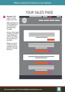
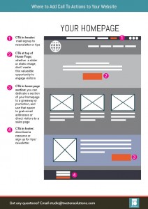
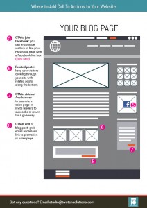
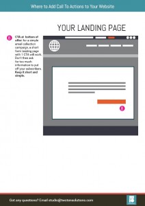
Click Here to Download Your Cheat Sheet >>
How should your Call To Action look?
You can create links or buttons, but I would recommend going for buttons. Use contrasting colours so they stand out against the rest of your site.
Try to look at your site objectively, as if you were a new visitor. Are your eyes drawn to the CTA buttons as you skim the page? Better yet, get someone to visit your site and give you feedback on how much the buttons jump out. If you need help with deciding on good contrast colours, visit a website like Adobe Kuler and select complementary colours. Plug in your site and brand colours and you’ll get suggestions on good colours that will stand out without clashing.
Ideally you would only have one Call to Action per page, but realistically that’s not necessarily achievable. If you’re using your header and/or footer to encourage visitors to do something more (and you should be), they will be on every page by default. Just bear in mind that if you have too many buttons asking your visitors to do too many things, you’ll probably just cause overwhelm and confusion, resulting in them doing nothing.
What should your CTA say?
Try to avoid cliché terms like ‘Subcribe Now’, or ‘Click here’ that don’t really tell anyone anything. Think of what it is that you’re asking that person to do when they click the button, and then use words to describe that.
Some examples:
- Get A Free Quote
- Add To Cart
- Buy Now
- Sign up for Weekly Tips
- Download Cheat Sheet
- Join The Forum
In summary
- A Call to Action is an instruction to ask your website visitors to do something, to take an action
- Use them as part of your overall marketing strategy
- Make them stand out through colour and placement on the web page
- Use words that are specific, not generic
Do you have any more ideas around Call to Action? Share your ideas and feedback in the comments below!


