
Audience: ‘Good design’ isn’t a one size fits all approach. When you’re adding design touches to your website, or even designing your own fliers or brochures, as with all your marketing, you need to consider your target client.
If you’re a technical business, then a vintage, colourful approach will not impress your target market. They want to see a design that reflects your competence and professionalism.
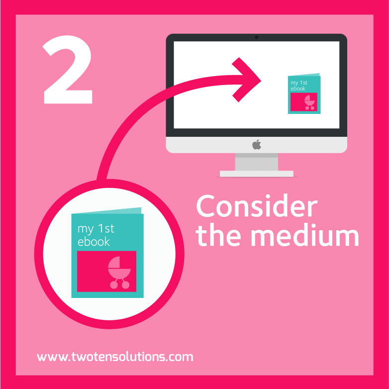
The final product: A good example of this is designing a cover for your ebook. A particular design may look great at full size on your computer, and it may look alright shrunk down on a tablet or phone.
Have you considered how it also works as a thumbnail image?
If you’re going to be using that cover image primarily as a device to grab the attention of your website visitors, then it needs to jump off the screen, even if it’s only tiny.
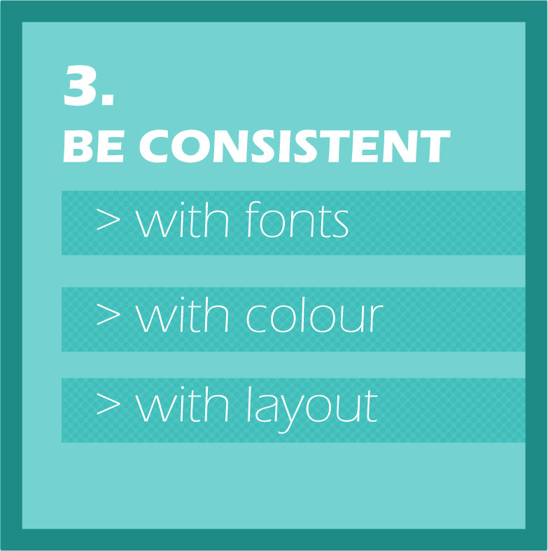
Consistency: Don’t use loads of different fonts in your designs. Usually 1 or 2 fonts is plenty. You can mix and match their bold and italic forms to create contrast.
Keep your design consistent. Once you’ve picked your fonts, colours and general layout pattern, stick with it. The most common mistake people make is that they think ‘good’ design should be complicated. The opposite is true – good design generally is simple.
Don’t confuse simple with ‘easy’ – it’s not necessarily easy – but simple, uncluttered and consistent is what you’re aiming for.
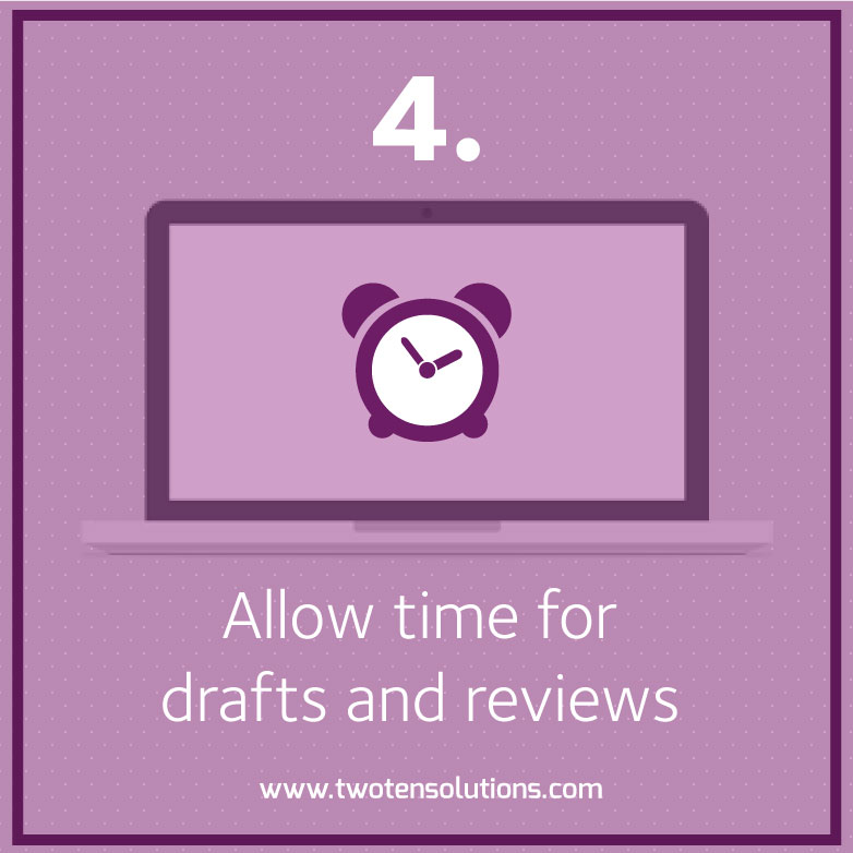
The editing process: Just as it takes time to craft a good blog post, or put together the copy for your website, you can’t expect to just sit down and knock out a good design. The approach to take is very similar to writing, actually.
Put aside some time to do a first draft, and try not to let your editing side take over yet. Try a few different things, move images around, put text over the top, make your text box transparent. Create a couple of options and then leave it alone.
Come back a day or 2 later, and see what your reaction is when you look at it. I often find that I have a gut instinct that something is working or not working. My client may not always agree with me, but most of the times I do get it right.
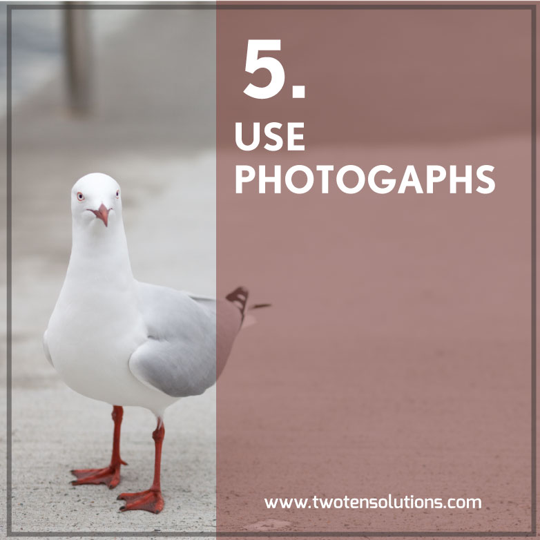
Photographs: A really simple and effective design approach is pairing photographs with text. A strong image, with text overlaid can look really nice. Make sure you put the text over a clear space in the image so that it stands out.
If there isn’t really a good existing spot, you can draw a box or rectangle behind the text and then reduce the opacity of the box.
To ensure your imagery is unique, why not take your own photographs to use in this way?
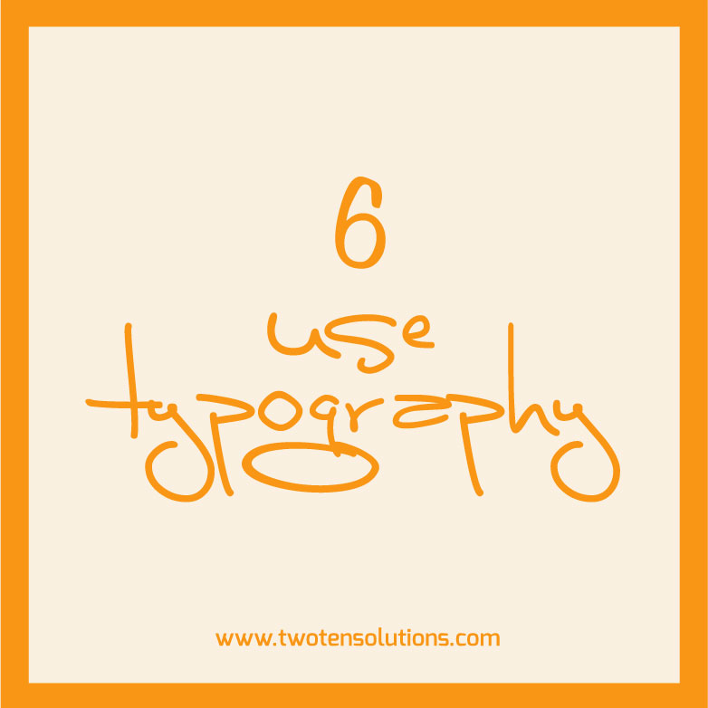
Typography: A nice simple design technique is to just use text on a simple, coloured background.
Mix up your fonts (not too many, less is still more here), and experiment with having all the text centred, or all pushed into one corner.
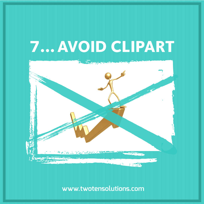
Avoid tacky clip art. Seriously. It is not doing anything to help your cause. I’m talking specifically about the cheesy, overused visual metaphors that are sprinkled all over the internet.
There are so many resources out there where you can get great illustrations for little to no cost. There is absolutely no excuse for clipart. None.
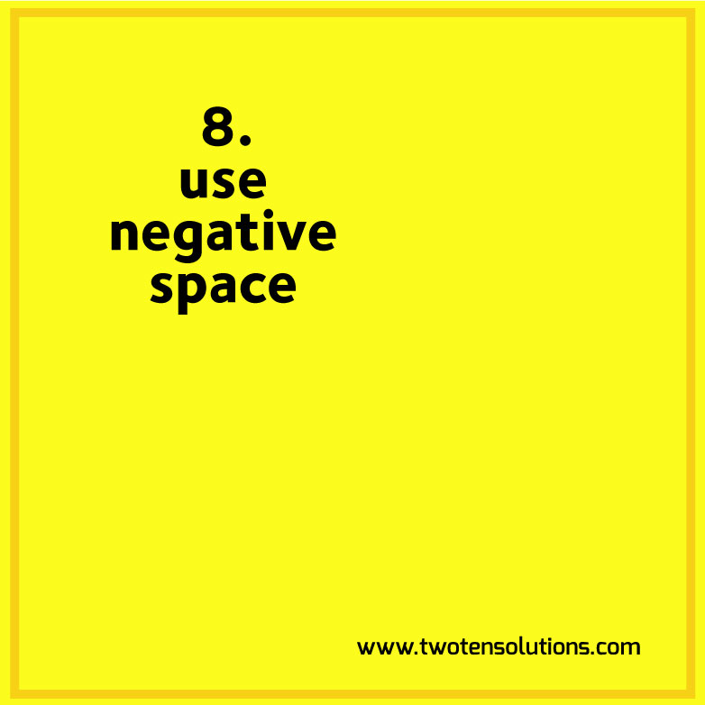
Negative space: is the amount of space left around the elements of your design. (white space is another term you may come across, but don’t feel you need to take it literally).
The whole point of design is that you want to get a message across, and to be successful that message needs to be clear. Visual breathing room lets the viewer read your message more clearly.
A page or website that is cluttered with too much stuff, is going to leave the visitor bouncing around, their eyes falling on one thing, then another, then another. It’s chaotic, confusing and – for me at least – annoying.
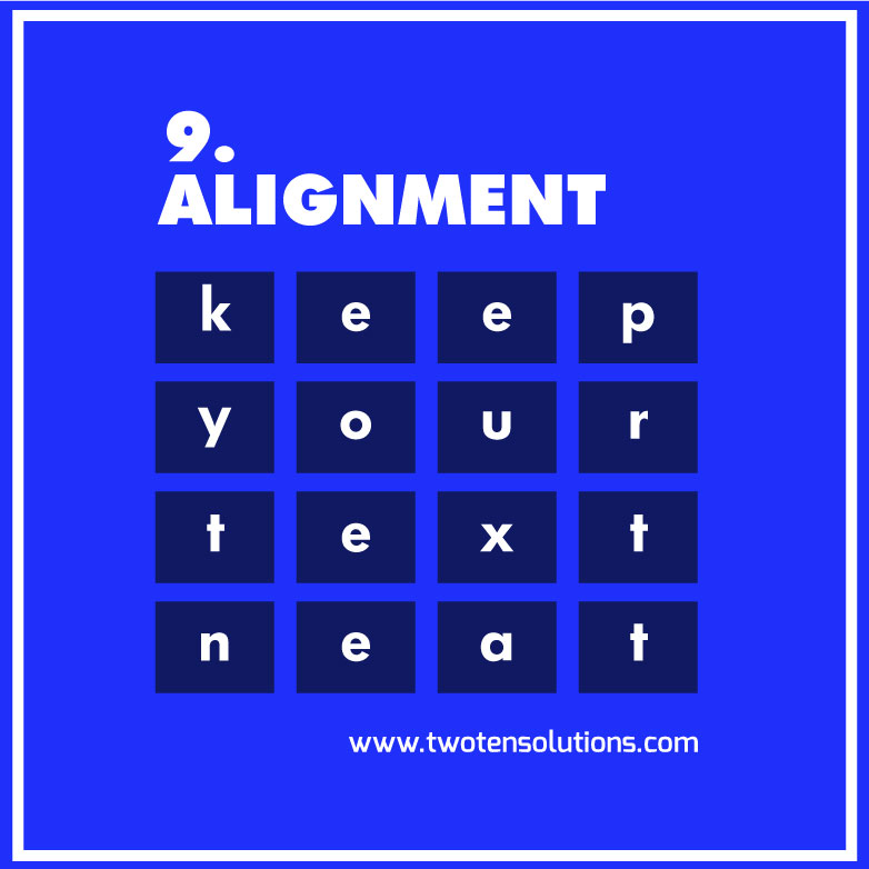
Alignment: So easy to do, and it makes such a massive difference. Take the time to make sure the elements in each group of your design are aligned properly. Even in programmes like PowerPoint there are built-in tools to help you achieve this.
Elements that are all sitting on the same vertical and horizontal plane make visual sense and therefore add to your message. Elements that are higgledy-piggledy are confusing, annoying and generally unpleasant to look at.
In conclusion: These are really very simple techniques, and not hard to achieve by yourself.
Instead of having yet another generic stock image at the top of your post, put aside some time one day to come up with a template or idea that you can then use for all your posts. It will give your posts a visual consistency that ties back in with your brand, in the way that yet another picture of a kid in a cape wearing oversized glasses just doesn’t.